
The Art of Color: How to Use Color Theory to Elevate Your Outfits
Color theory for fashion can instantly transform your style. Discover smart outfit tips and use color confidently, whatever your budget.
Ever stood in front of your closet, feeling paralyzed by too many color choices? You’re not alone. Most people have a gut sense for what “looks good,” but translating that into outfits is another story. Looking put-together isn’t just about having great clothes – it’s about knowing how to use color to your advantage.
Research and interviews with stylists show that Color theory for fashion is one of the most common areas of confusion for style-conscious adults. Everyone asks: How do I pair hues without looking mismatched? Which tones flatter my skin best? Does wearing bold contrast actually draw positive attention, or is subtle harmony better? These questions matter, and the right answers can change how you shop, dress, and feel.
The problem is, most advice out there is either too rigid (“Never mix red and green!”) or painfully generic (“Just wear more color!”). Quick fixes may get you through a single outfit, but they won’t help you develop a flexible, personal sense of style that lasts.
This guide is different. We’ll break down the practical science behind stylish color combos, plus how to build a wardrobe that works for your body, skin tone, and lifestyle. You’ll get expert-backed tips, clear visuals, and examples you can actually use. Ready to master color for real? Let’s get started.
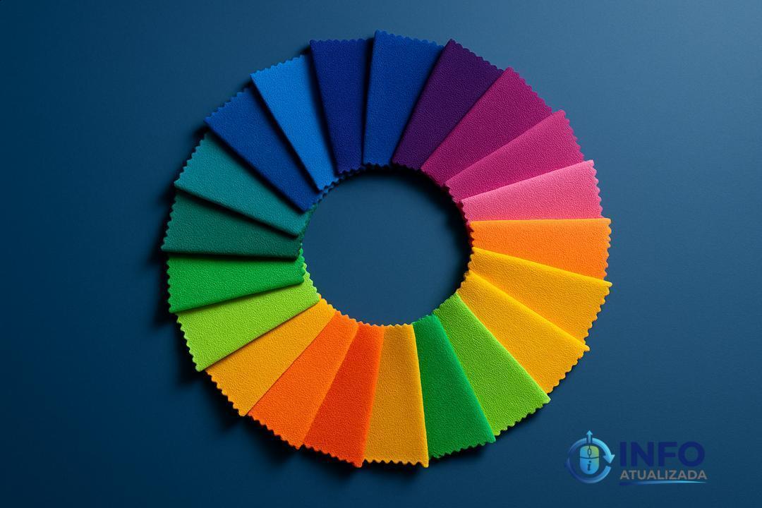
Understanding the Basics of the Color Wheel
Learning the color wheel basics can change the way you get dressed. It’s not about memorizing rules. It’s about knowing how different colors relate, so your outfits instantly look more pulled together.
Primary vs secondary colors in clothing
Primary colors are red, blue, and yellow these create all other colors. Secondary colors (orange, green, purple) come from mixing primaries. Tertiary colors fill in the gaps, like teal or burgundy.
Think of it this way: a red dress or yellow blazer brings energy because primary colors are bold and direct. Using secondary colors in one piece, like a purple skirt, adds a playful, modern vibe. Mix them for outfits that “pop” try a blue top with an orange scarf. Many stylists recommend picking one dominant color and using a secondary or tertiary as an accent for easy harmony.
Hue, value, and chroma: The three dimensions of color
Every color has three parts: hue (the name), value (light or dark), and chroma (how intense). These affect how clothes look and feel together.
Example: A pastel blue (light value, low chroma) feels airy great for spring shirts while a deep emerald (dark value, high chroma) looks rich and formal, perfect for an evening dress. The trick is to balance your outfit. If one piece is super vibrant, try softer shades elsewhere. According to color experts, using varied intensity stops a look from becoming “too much.” Next time you try on outfits, compare a muted khaki pant with a bright red tee and see how the balance shifts.
Warm vs cool tones and why they matter
Warm tones (think reds, oranges, yellows) give off energy. Cool tones (blues, greens, purples) feel calm and crisp. Knowing your skin undertone is key: most people have warm, cool, or neutral undertones, which can make certain shades either flattering or harsh.
If you’re not sure, try holding gold (warm) and silver (cool) fabric near your face. The one that makes your skin glow probably matches your undertone. Stylists suggest that if you wear warm clothing like a spicy orange jacket stick to other warm accents, or mix with neutrals like tan or cream. If you’re a fan of cool colors, navy or teal is an easy base, with lavender or icy blue accents for a fresh finish.
Building Color Schemes That Work: Monochromatic, Analogous, and Complementary
Color schemes aren’t just theory they turn your closet into a toolkit. Monochromatic, analogous, and complementary schemes are the keys for looks that work every time. Let’s see how to use each one, without getting lost in color rules.
How to create monochrome looks without looking flat
Monochromatic schemes use one hue with variations in lightness, darkness, and intensity. This creates harmony and drama but can look dull if overdone.
Avoid blandness by mixing textures (like denim, silk, and wool) or adding subtle pattern. For example, try navy jeans with a pale blue tee and a sapphire scarf. Benjamin Moore’s experts recommend “using multiple shades… softens the look.” Even switching up gloss like matte pants with a shiny jacket makes blues look fresh, not stale.
Analogous shades for a harmonious vibe
Analogous schemes use colors next to each other on the wheel, like blue, teal, and green. This style feels gentle and connected because there’s no jarring contrast.
Try pairing a green shirt, teal sweater, and navy sneakers for an easy, stylish day look. According to specialists, this approach “softens monochromatic rigidity without clashing.” You get depth and movement in your outfit, and it’s almost impossible to go wrong think of a sunset: gold through orange to red, all blending naturally.
Complementary colors for high impact
Complementary schemes use colors opposite each other, like red and green or blue and orange, for high-impact contrast. These combinations draw maximum attention and energy.
If you want to make a bold statement, layer a cobalt blue dress with a burnt orange bag. Experts suggest picking a dominant color and using smaller accents for cohesion, “to avoid chaos.” Use black, white, or neutrals as a base if you’re nervous; a classic example is red paired with black-and-white for drama without looking like a holiday ad.
Personal Palette: Matching Colors to Your Skin Tone and Style
Your ideal colors should feel like a natural extension of you. Building a personal palette means knowing what works for your skin tone and making sure your wardrobe makes you look and feel amazing.
Seasonal color analysis basics
Seasonal color analysis matches people to a palette spring, summer, autumn, or winter based on skin undertones, eye, and hair color. Each season has distinctive shades. For example, Winter palettes suit cool tones and high contrast, while Autumns shine in warm, muted hues.
Stylists often use this method to help clients shop smarter and prevent costly mistakes. One study found seasonal matching reduced wardrobe waste for most participants. Try searching online for “seasonal color quiz” as a starting point or better yet, ask a color consultant for confidence.
Finding your undertone (and what not to do)
Your undertone stays the same, even if your skin gets lighter or darker in different seasons. Most people are cool, warm, or neutral, and this impacts which colors flatter them.
To check yours, look at the veins on your wrist are they blue or greenish? Try both gold (warm) and silver (cool) jewelry; the metal that “pops” probably matches your undertone. Experts warn: Don’t rely on internet hacks alone; lighting and screens can mislead. If you’re unsure, use natural daylight and a white tee as your test base.
Developing a core wardrobe palette
A core palette makes building outfits stress-free. It usually includes 4-6 main colors that coordinate, plus neutrals.
Pick 2-3 base neutrals (like navy, white, or gray), 2 accent colors from your season, and an “extra” fun pop. For example: a Summer palette might use white, chambray blue, soft pink, and dove gray. Seasoned stylists recommend building around these colors before shopping for trends. When your closet follows a personal palette, most pieces naturally mix and match saving you money and daily decision time.
Pro Tips: Avoiding Color Clashes and Mastering Visual Balance
Ever put together an outfit that just didn’t sit right? A balanced outfit is rarely about luck it’s about knowing a few expert tricks for mixing colors, brightness, and intensity.
The biggest color clash mistakes
The most common mistakes happen when pairing colors that fight for attention or blend into each other. Pairing similar brights like hot pink with red or colors with low contrast (such as yellow with green) almost always feels off. Matching strong colors like dark brown and black together can also muddle your look.
If you love bold shades, experts suggest anchoring each one in a separate outfit, or using neutrals as a “reset.” Keep your look sharp by avoiding two neons together unless you’re ready for serious attention.
Using brightness and contrast to your advantage
Using brightness is an easy way to create energy or add calm. Complementary colors those across the color wheel offer instant pop, like blue with orange.
But too little contrast (yellow on green) can look washed out and even harder to see. If your style is bright, ground it with white, gray, or black for an intentional feel. A high-contrast outfit (like a crisp black blazer with a neon top) looks bold but still balanced.
Expert tricks: Varying intensity for wearable looks
Varying intensity is the pro move for everyday style. Loud colors need rich textures think velvet, denim, or chunky knits to shine. If your outfit is super vibrant, balance it with tailored shapes or one big pop of color instead of several.
Experts love to finish bold looks with just a touch of clash: a bright bag, a fun pair of shoes, or a statement earring. With a single accent, you show personality without losing harmony.
The bottom line: Making color work for you every day
You can absolutely make color work for you every single day. There’s no need for guesswork you just need a few smart strategies and the guts to experiment.
Stylists and research agree: building a small, personal palette streamlines both shopping and getting dressed, while mixing textures, brightness, and intensity keeps even the simplest outfits interesting. Experts suggest picking a couple of “winning” colors close to your face, then rotating bolder shades in shoes, bags, or accessories for variety without overwhelm.
One proven trick is using neutrals as anchors navy, black, cream, or gray so you’re always working from a safe zone. Then, toss in color pops: try a vibrant scarf with a denim jacket, or color-block your workout gear for extra energy. Most people who master color say they feel more put-together and get more compliments, even on low-budget pieces.
The bottom line: Color isn’t just for “special” days. With a little planning and a bit of courage, your whole wardrobe can feel new day in and day out. Start simple, pay attention to how colors make you feel, and let your palette grow with you.